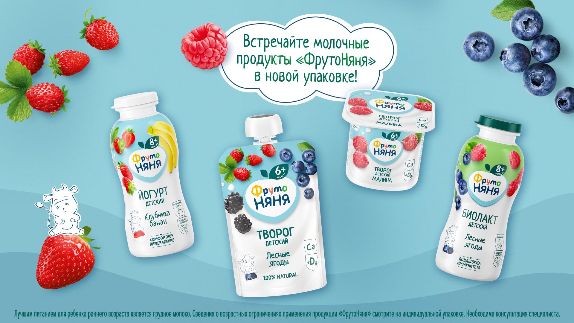
The new design has been created based on the needs of modern parents and children. The updated line of fermented milk products now holds a stronger association with the dairy category due to the addition of white color. The white highlights the structure of the product and reflects the brand's continued commitment to naturalness, safety and high quality.
One of the main differences of the updated design is a package rid of unnecessary, distracting elements. Thanks to the large presence of the white, the brand's milk line is now much easier to find on the shelf. At the same time, the design retains the traditional elements of the brand and its bright characters without losing recognition. Clear and understandable labels will easily allow the parents to choose the appropriate product for their first acquaintance with the category or to get to know the fermented milk products with the addition of berries and fruits.
Look for FrutoNyanya dairy products in new packaging in local city stores this summer!